THE DROP NUTRITION
Date: April 2019
Objective: Logo Creation
Deliverables: Logo, Complimentary Typography
Tools: Illustrator
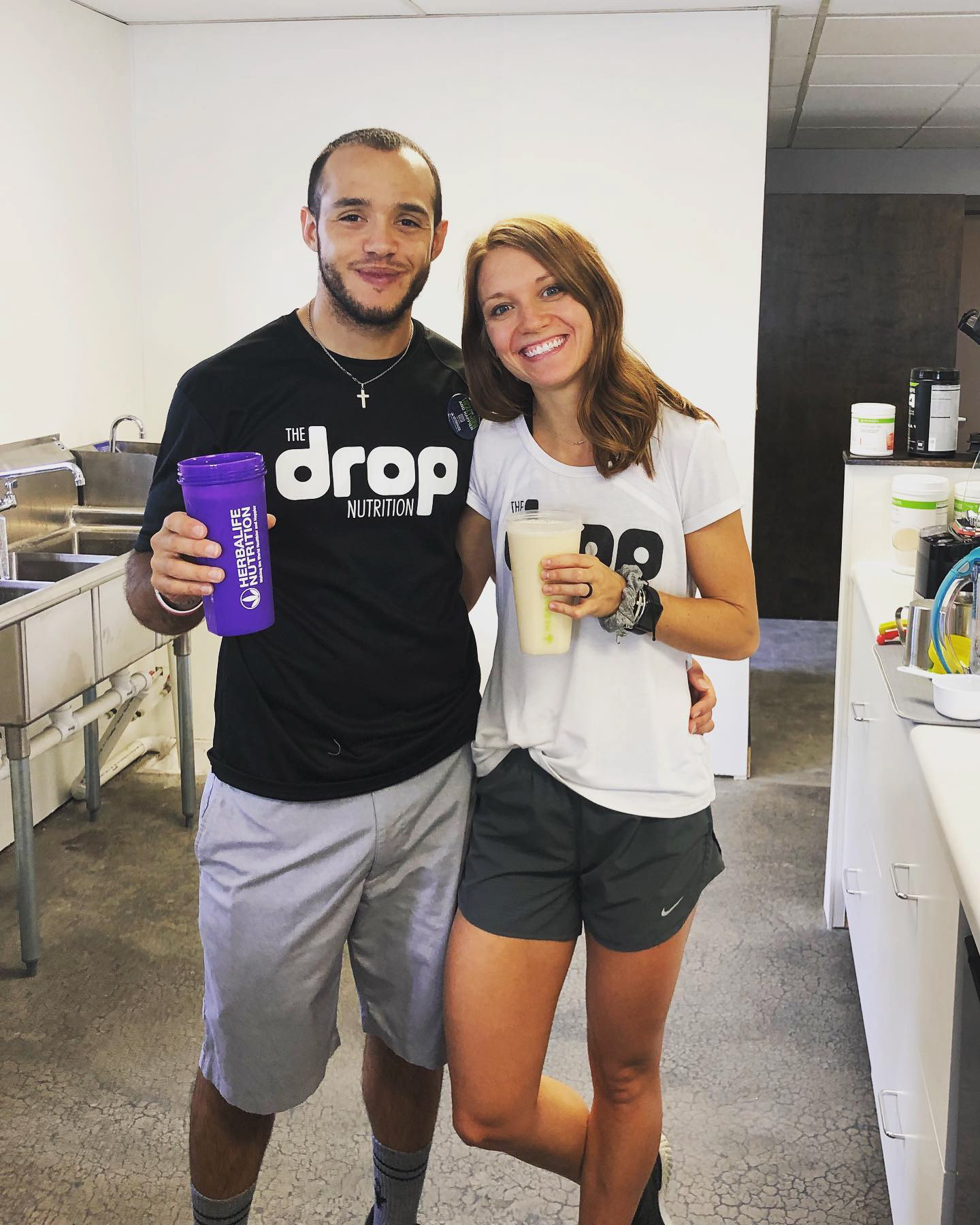
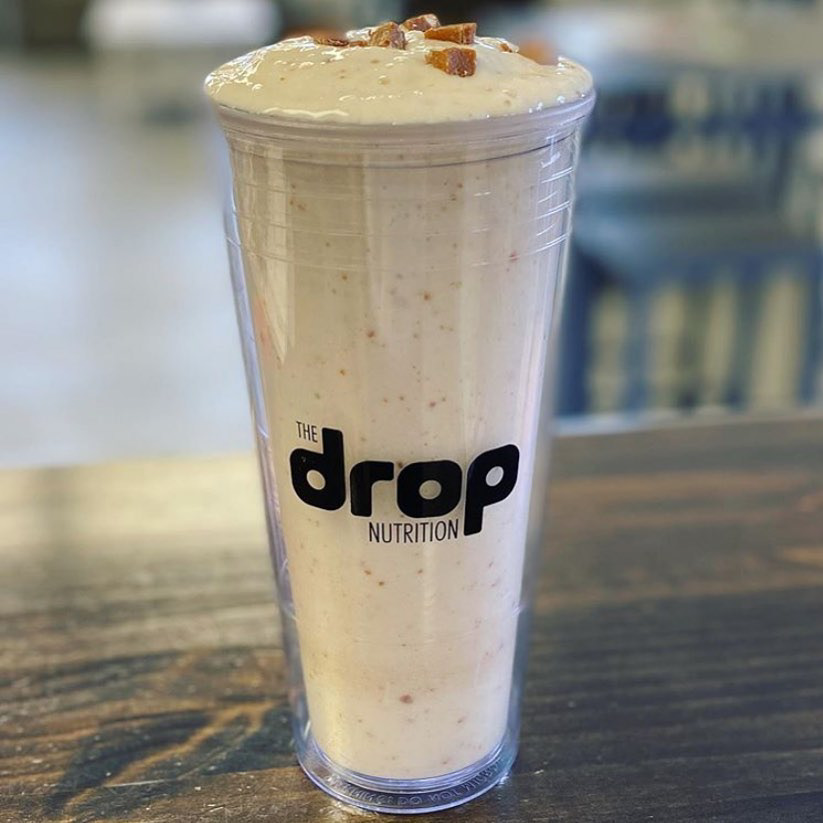
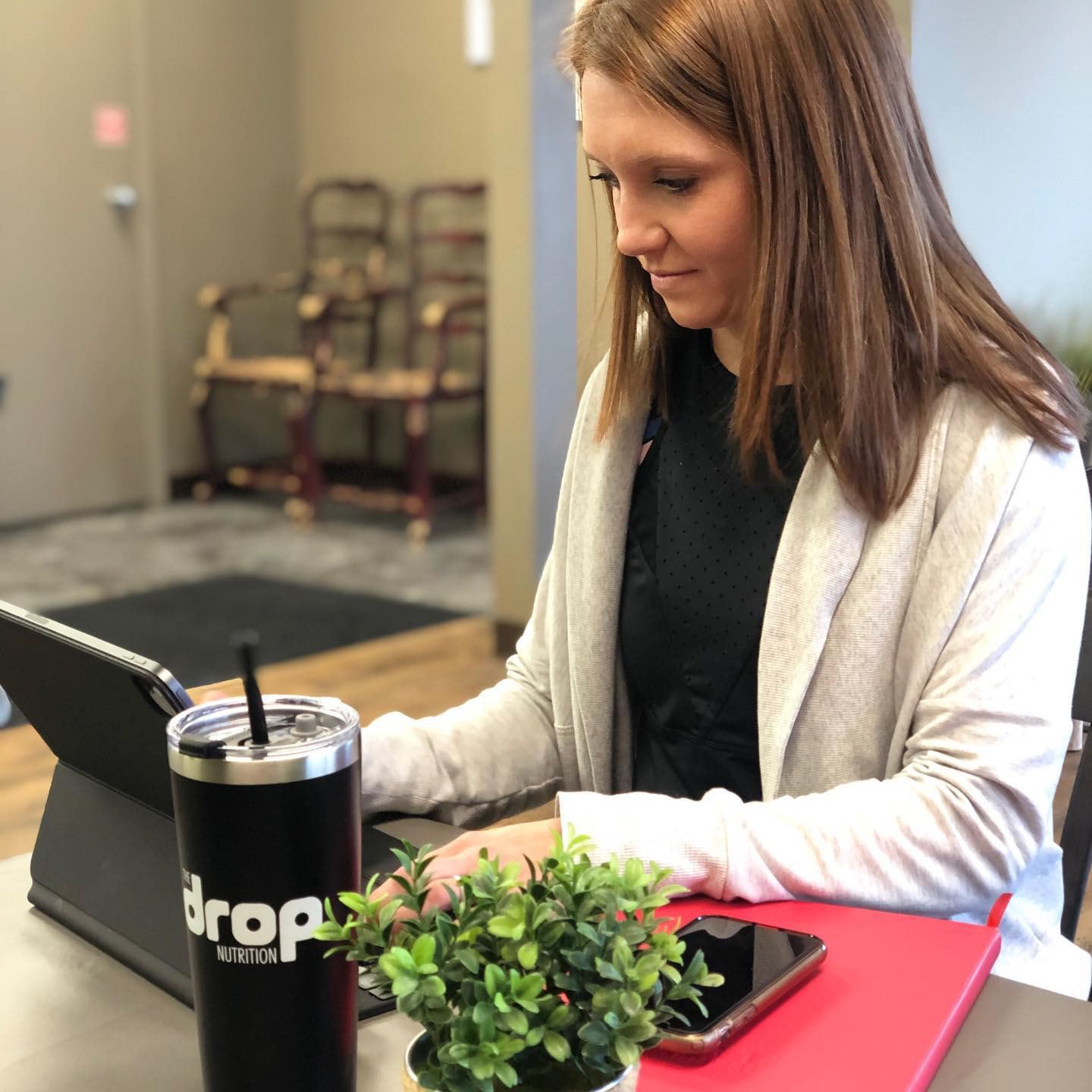
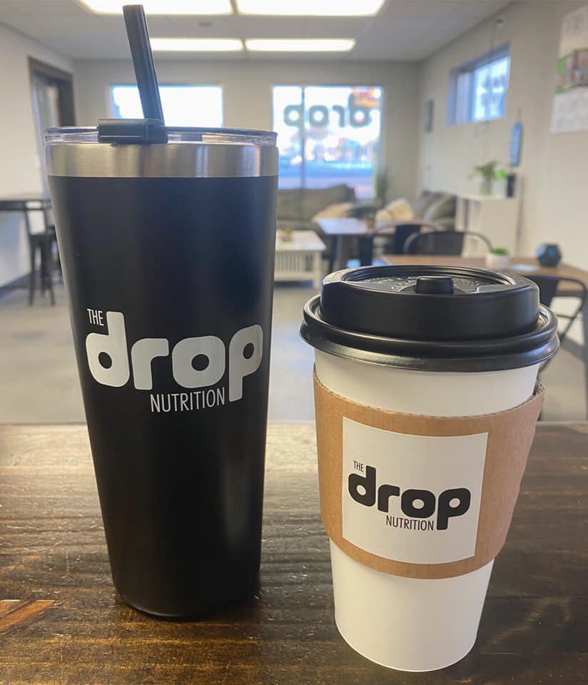
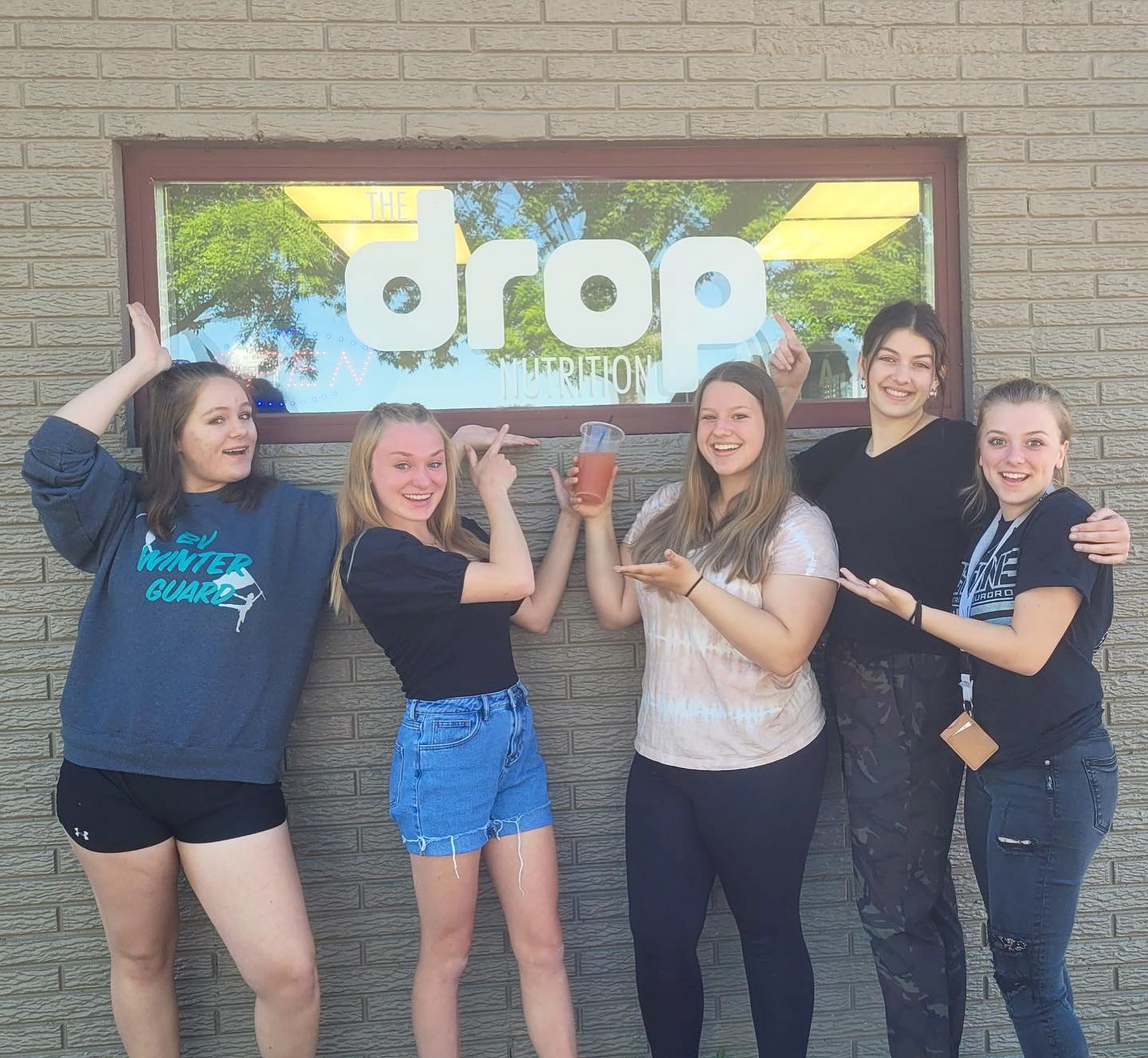
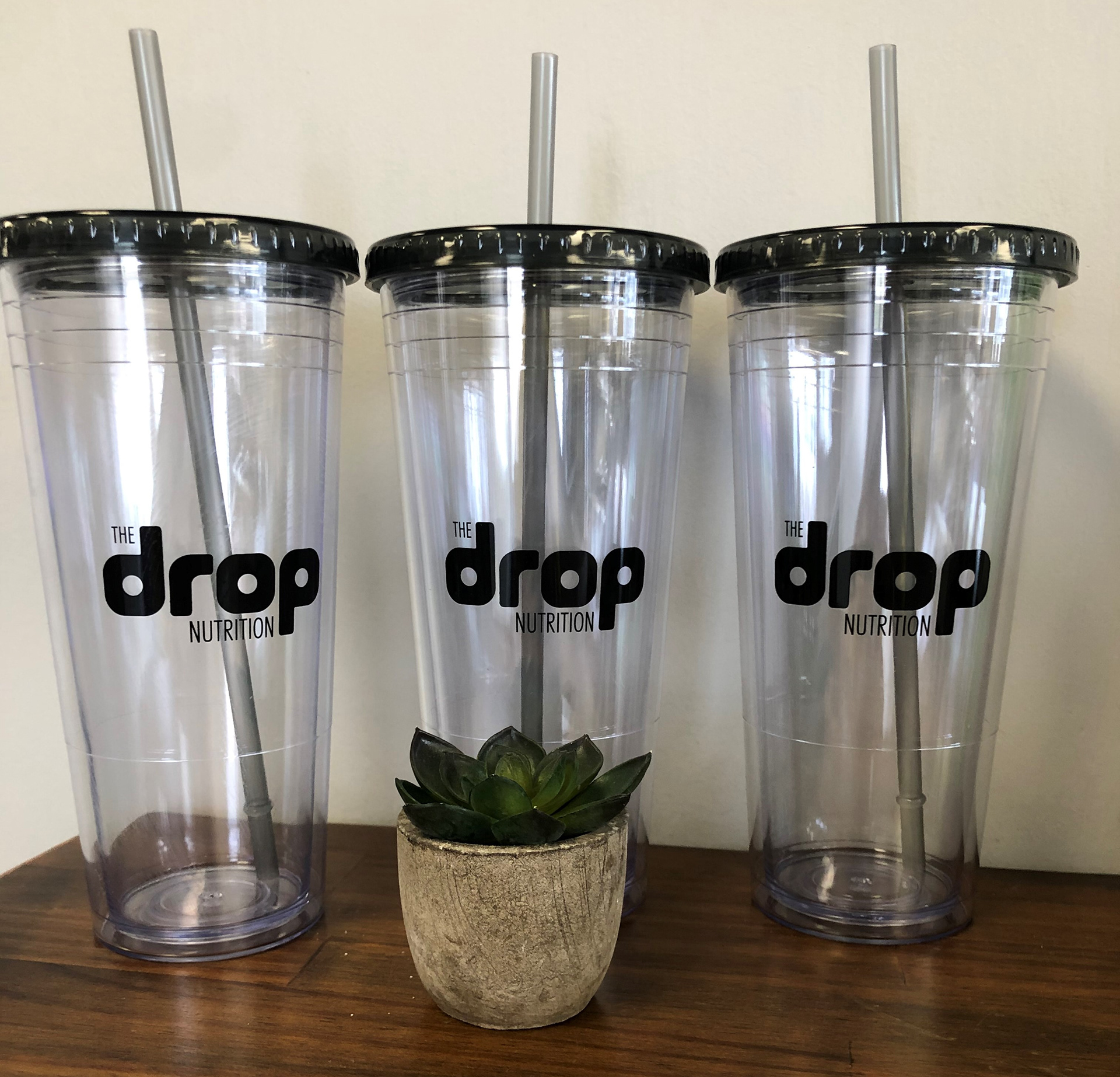
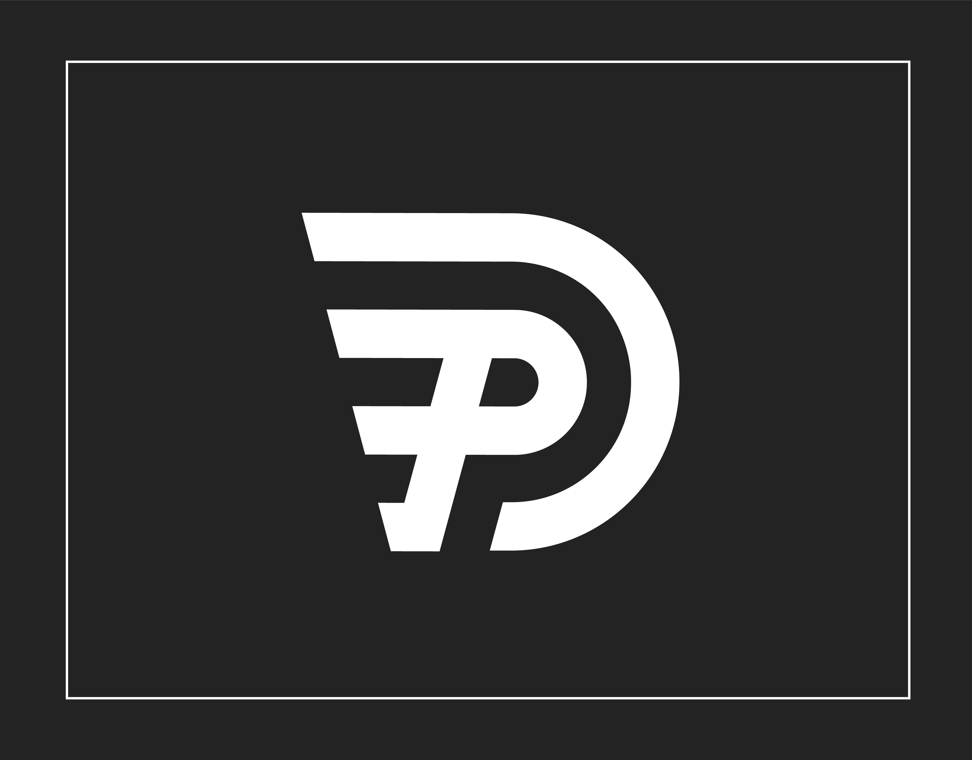
The Drop Nutrition is a fast growing nutrition club located in South Dakota. They wanted a simple logo that was quick to read but still have personality that represents the two creators energy. The drop nutrition logo does not include any imagery and the logotype is bold and energetic. The word drop in rounded to appear fun and upbeat. The perfect circles inside the letters represent the cups often used in the club. The nutrition clubs logo is designed to primarily be used in black and white in order to bring down the cost significantly for the client. The client is able to use color when using digital versions of the logo.
